The problem it solves
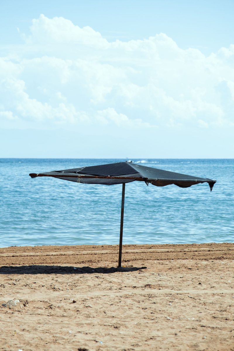
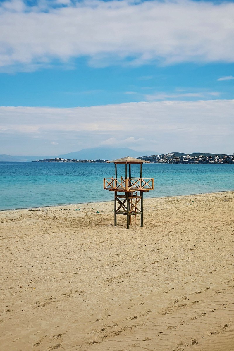
Almost every photo you own is the wrong shape for almost every place you want to put it. Phone photos are tall; banners, headers and cover images are wide. The usual answers are to crop, which loses the subject, or to add coloured bars, which looks like a placeholder.
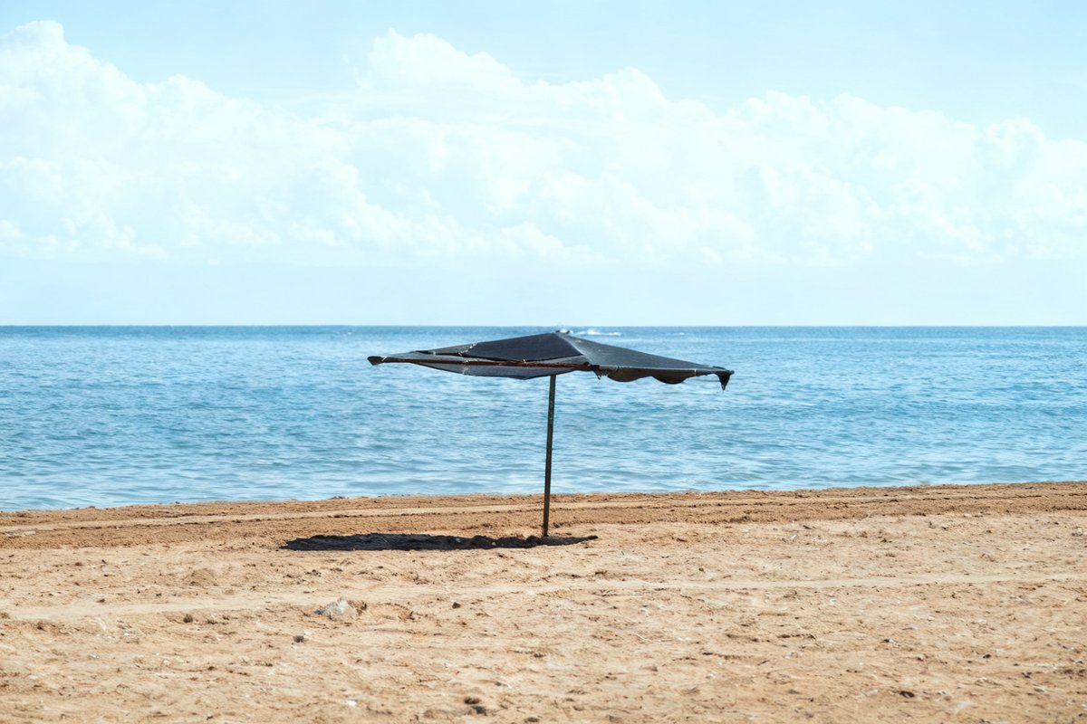
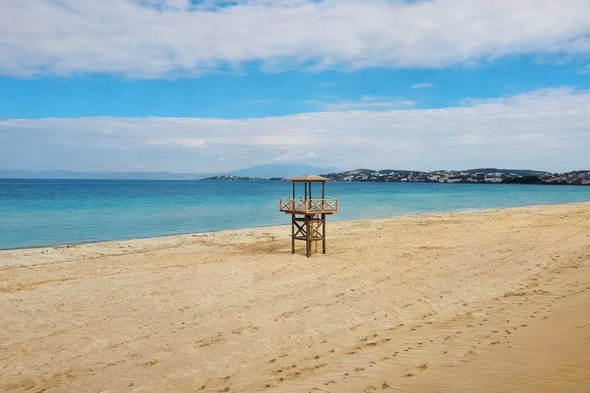
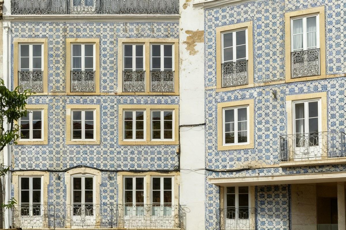
Extending gives you a third option: keep the whole original and invent the parts of the scene that were outside the frame. The subject stays where it was and at the size it was, and the new space is continuous with what was already there.
This is also the fix for a crop that is too tight. A photo taken with no headroom, where the top of someone is nearly at the edge, can have that room added back.
What extends convincingly
As an AI image extender, it continues light and texture past the original border instead of tiling pixels.
Continuous textures are the easy case and they are close to perfect: sky, water, sand, grass, foliage, walls, carpet, road surface, plain studio backdrops. There is no structure to get wrong, so there is nothing to notice.
Blurred backgrounds extend very well for the same reason. A portrait shot at a wide aperture has a background that is already a soft wash, and continuing it is easy.
Simple architecture usually holds. A wall continuing sideways, a floor continuing forward, a horizon continuing outward — these follow obvious rules and the model follows them.
Getting a seamless extension
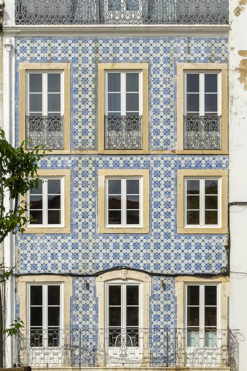
Structured repetition is where extension fails visibly. Window grids, tiled floors, brickwork, railings and fence posts have a rhythm, and the model can lose count — spacing drifts, a row does not line up, a window is half a window. Look along the join.
Anything partially in frame at the edge will be completed by invention. Half a person at the edge becomes a whole invented person. Half a car becomes a car that may not have the right number of doors. If something is cut by the original frame, decide whether you want it completed at all.
Do not extend far in one step. A modest widening reads as one photograph; a very large extension gives the model too much freedom and the invented region starts to disagree with the original in lighting and perspective. Two moderate passes beat one aggressive one.
Writing the instruction
Say the direction and what should be there: "extend the image to the left and continue the beach and sky". Direction alone leaves the content open; content alone leaves the direction open.
If the new space should stay empty for text to sit on later — a header image with a headline over it — say so. "Extend to the right with plain open sky" gives you somewhere to put type.
Where the extension will be cropped anyway, extend generously and crop after. It is easier to discard invented pixels than to ask for a precise amount.
The shapes people actually need
A wide banner from a tall phone photo is the most common request by a distance. Social headers, site heroes and video thumbnails all want something around twice as wide as it is tall, and a phone photo is the opposite of that, so the extension is doing real work rather than a cosmetic tidy.
Square from portrait is the second. Marketplace listings and profile grids want square, and cropping a portrait to square usually cuts through the subject. Extending sideways keeps the whole subject and adds the space the crop would have taken.
Adding headroom is the quiet third case. A photo where someone is framed too tightly at the top reads as an accident, and adding a small amount of ceiling or sky above them fixes it more convincingly than cropping tighter to disguise it.
In all three, extend along one axis rather than all four at once. Extending outward in every direction gives the model four independent joins to keep consistent and multiplies the chance one of them disagrees with the original.
Cost, limits and privacy
12 free credits without an account, spent once. An account adds 12 fresh credits every day. Extensions are edits, so they are never watermarked on any tier.
Uploads are deleted after processing and result links expire on their own. Maximum upload 10 MB, in JPG, PNG or WebP.
Questions people ask
Is this the same as outpainting?
Yes. Outpainting is the technical name for continuing an image past its original edges, which is what this does.
How far can I extend?
A modest extension holds together best. Large extensions give the model enough freedom that the invented region starts to disagree with the original in lighting and perspective. Two moderate passes beat one aggressive one.
Why did the extended brickwork come out misaligned?
Repeating structure is the known weak point. Brick, tiles, window grids and railings have a rhythm the model can lose count of. Continuous textures like sky, water and foliage extend far more reliably.
Can I use this to make a wide header image?
That is the most common use. Extend sideways and ask for plain open sky or a simple surface in the new space so there is somewhere clean for a headline to sit.